Quickstart

This guide will help you get started with VegasAfterglow quickly. We’ll cover basic installation, setting up a simple model, and running your first afterglow parameter estimation.

Installation

The easiest way to install VegasAfterglow is via pip:

pip install VegasAfterglow

For more detailed installation instructions, see the Installation page.

Basic Usage

VegasAfterglow is designed to efficiently model gamma-ray burst (GRB) afterglows and perform Markov Chain Monte Carlo (MCMC) parameter estimation.

Direct Model Calculation

Before diving into MCMC parameter estimation, you can directly use VegasAfterglow to generate light curves and spectra from a specific model. Let’s start by importing the necessary modules:

import numpy as np
import matplotlib.pyplot as plt
from VegasAfterglow import ISM, TophatJet, Observer, Radiation, Model

Then, let’s set up the physical components of our afterglow model, including the environment, jet, observer, and radiation parameters:

# 1. Define the circumburst environment (constant density ISM)
medium = ISM(n_ism=1) # in cgs unit

# 2. Configure the jet structure (top-hat with opening angle, energy, and Lorentz factor)
jet = TophatJet(theta_c=0.1, E_iso=1e52, Gamma0=300) # in cgs unit

# 3. Set observer parameters (distance, redshift, viewing angle)
obs = Observer(lumi_dist=1e26, z=0.1, theta_obs=0) # in cgs unit

# 4. Define radiation microphysics parameters
rad = Radiation(eps_e=1e-1, eps_B=1e-3, p=2.3)

# 5. Combine all components into a complete afterglow model
model = Model(jet=jet, medium=medium, observer=obs, fwd_rad=rad)

Light Curve Calculation

Now, let’s compute and plot multi-wavelength light curves to see how the afterglow evolves over time:

# 1. Create logarithmic time array from 10² to 10⁸ seconds (100s to ~3yrs)
times = np.logspace(2, 8, 200)

# 2. Define observing frequencies (radio, optical, X-ray bands in Hz)
bands = np.array([1e9, 1e14, 1e17])

# 3. Calculate the afterglow emission at each time and frequency
results = model.flux_density_grid(times, bands)

# 4. Visualize the multi-wavelength light curves
plt.figure(figsize=(4.8, 3.6), dpi=200)

# 5. Plot each frequency band
for i, nu in enumerate(bands):
    exp = int(np.floor(np.log10(nu)))
    base = nu / 10**exp
    plt.loglog(times, results.total[i,:], label=fr'${base:.1f} \times 10^{{{exp}}}$ Hz')

# 6. Add annotations for important transitions
def add_note(plt):
    plt.annotate('jet break',xy=(3e4, 1e-26), xytext=(3e3, 5e-28), arrowprops=dict(arrowstyle='->'))
    plt.annotate(r'$\nu_m=\nu_a$',xy=(6e5, 3e-25), xytext=(7.5e4, 5e-24), arrowprops=dict(arrowstyle='->'))
    plt.annotate(r'$\nu=\nu_a$',xy=(1.5e6, 4e-25), xytext=(7.5e5, 5e-24), arrowprops=dict(arrowstyle='->'))

add_note(plt)

plt.xlabel('Time (s)')
plt.ylabel('Flux Density (erg/cm²/s/Hz)')
plt.legend()
plt.title('Light Curves')
plt.tight_layout()
plt.savefig('assets/quick-lc.png', dpi=300)
_images/quick-lc.png

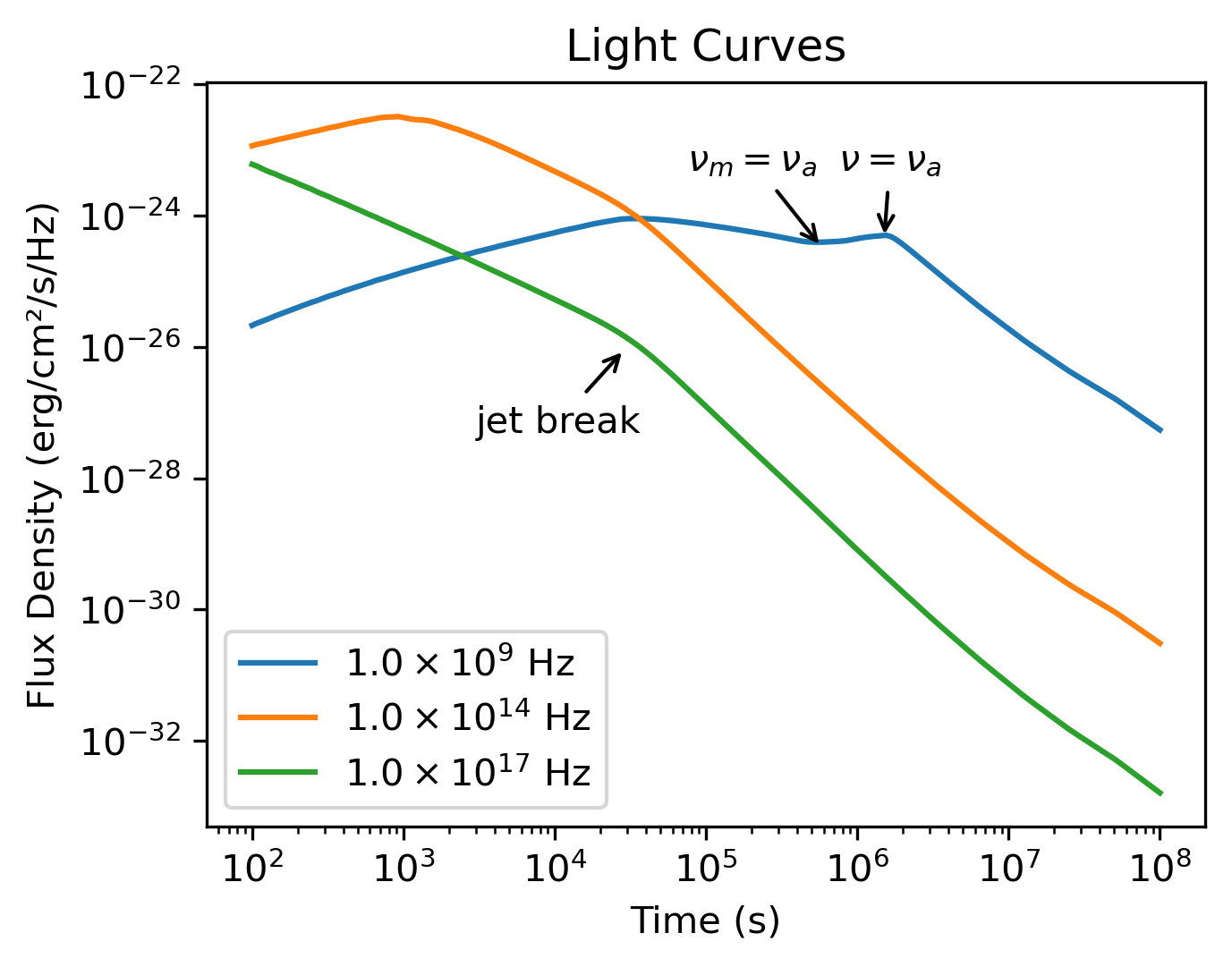
Running the light curve script will produce this figure showing the afterglow evolution across different frequencies.

Spectral Analysis

We can also examine how the broadband spectrum evolves at different times after the burst:

# 1. Define broad frequency range (10⁵ to 10²² Hz)
frequencies = np.logspace(5, 22, 200)

# 2. Select specific time epochs for spectral snapshots
epochs = np.array([1e2, 1e3, 1e4, 1e5, 1e6, 1e7, 1e8])

# 3. Calculate spectra at each epoch
results = model.flux_density_grid(epochs, frequencies)

# 4. Plot broadband spectra at each epoch
plt.figure(figsize=(4.8, 3.6),dpi=200)
colors = plt.cm.viridis(np.linspace(0,1,len(epochs)))

for i, t in enumerate(epochs):
    exp = int(np.floor(np.log10(t)))
    base = t / 10**exp
    plt.loglog(frequencies, results.total[:,i], color=colors[i], label=fr'${base:.1f} \times 10^{{{exp}}}$ s')

# 5. Add vertical lines marking the bands from the light curve plot
for i, band in enumerate(bands):
    plt.axvline(band, ls='--', color=f'C{i}')

plt.xlabel('Frequency (Hz)')
plt.ylabel('Flux Density (erg/cm²/s/Hz)')
plt.legend(ncol=2)
plt.title('Synchrotron Spectra')
plt.tight_layout()
plt.savefig('assets/quick-spec.png', dpi=300)
_images/quick-spec.png

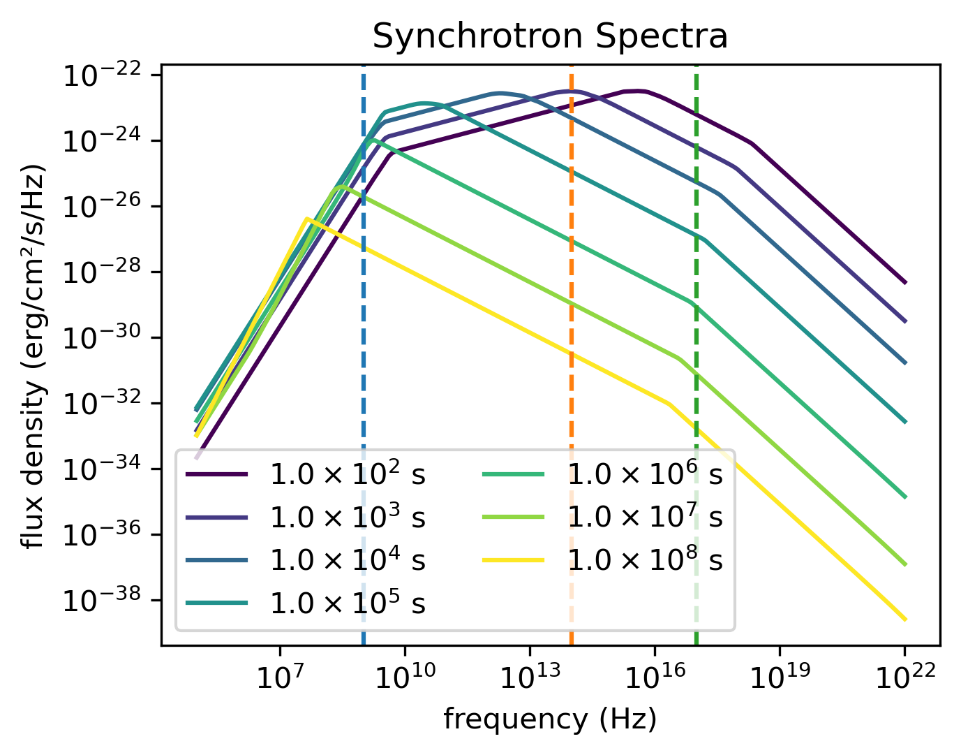
The spectral analysis code will generate this visualization showing spectra at different times, with vertical lines indicating the frequencies calculated in the light curve example.

Internal Quantities Evolution

VegasAfterglow provides comprehensive access to internal simulation quantities, allowing you to analyze the temporal evolution of physical parameters across different reference frames. This advanced feature enables detailed investigation of shock dynamics, microphysical parameters, and relativistic effects throughout the afterglow evolution.

Model Setup for Internal Analysis

Similar to the light curve generation, let’s set up the physical components of our afterglow model with additional resolution parameters for detailed internal tracking:

import numpy as np
import matplotlib.pyplot as plt
from VegasAfterglow import ISM, TophatJet, Observer, Radiation, Model

medium = ISM(n_ism=1)
jet = TophatJet(theta_c=0.3, E_iso=1e52, Gamma0=100)
obs = Observer(lumi_dist=1e26, z=0.1, theta_obs=0.)
rad = Radiation(eps_e=1e-1, eps_B=1e-3, p=2.3)

# Include resolution parameters for detailed internal tracking
model = Model(jet=jet, medium=medium, observer=obs, fwd_rad=rad, resolutions=(0.3,1,10))

Accessing Simulation Quantities

Now, let’s access the internal simulation quantities using the details method:

# Get the simulation details over a time range
details = model.details(t_min=1e0, t_max=1e8)

# Print the available attributes
print("Simulation details attributes:", dir(details))
print("Forward shock attributes:", dir(details.fwd))

You will get a SimulationDetails object with the following structure:

Main grid coordinates:

  • details.phi: 1D numpy array of azimuthal angles in radians

  • details.theta: 1D numpy array of polar angles in radians

  • details.t_src: 3D numpy array of source frame times on coordinate (phi_i, theta_j, t_k) grid in seconds

Forward shock details (accessed via ``details.fwd``):

  • details.fwd.t_comv: 3D numpy array of comoving times for the forward shock in seconds

  • details.fwd.t_obs: 3D numpy array of observer times for the forward shock in seconds

  • details.fwd.Gamma: 3D numpy array of downstream Lorentz factors for the forward shock

  • details.fwd.Gamma_th: 3D numpy array of thermal Lorentz factors for the forward shock

  • details.fwd.r: 3D numpy array of lab frame radii in centimeters

  • details.fwd.B_comv: 3D numpy array of downstream comoving magnetic field strengths for the forward shock in Gauss

  • details.fwd.theta: 3D numpy array of polar angles for the forward shock in radians

  • details.fwd.N_p: 3D numpy array of downstream shocked proton number per solid angle for the forward shock

  • details.fwd.N_e: 3D numpy array of downstream synchrotron electron number per solid angle for the forward shock

  • details.fwd.gamma_a: 3D numpy array of comoving frame self-absorption Lorentz factors for the forward shock

  • details.fwd.gamma_m: 3D numpy array of comoving frame injection Lorentz factors for the forward shock

  • details.fwd.gamma_c: 3D numpy array of comoving frame cooling Lorentz factors for the forward shock

  • details.fwd.gamma_M: 3D numpy array of comoving frame maximum Lorentz factors for the forward shock

  • details.fwd.nu_a: 3D numpy array of comoving frame self-absorption frequencies for the forward shock in Hz

  • details.fwd.nu_m: 3D numpy array of comoving frame injection frequencies for the forward shock in Hz

  • details.fwd.nu_c: 3D numpy array of comoving frame cooling frequencies for the forward shock in Hz

  • details.fwd.nu_M: 3D numpy array of comoving frame maximum frequencies for the forward shock in Hz

  • details.fwd.I_nu_max: 3D numpy array of comoving frame synchrotron maximum specific intensities for the forward shock in erg/cm²/s/Hz

  • details.fwd.Doppler: 3D numpy array of Doppler factors for the forward shock

Reverse shock details (accessed via ``details.rvs``, if reverse shock is enabled):

  • Similar attributes as forward shock but for the reverse shock component

Multi-Parameter Evolution Visualization

To analyze the temporal evolution of physical parameters across different reference frames, we can visualize how key quantities evolve in the source frame, comoving frame, and observer frame. This code creates a comprehensive multi-panel figure displaying the temporal evolution of fundamental shock parameters across all three reference frames:

attrs =['Gamma', 'B_comv', 'N_p','r','N_e','I_nu_max']
ylabels = [r'$\Gamma$', r'$B^\prime$ [G]', r'$N_p$', r'$r$ [cm]', r'$N_e$', r'$I_{\nu, \rm max}^\prime$ [erg/s/Hz]']

frames = ['t_src', 't_comv', 't_obs']
titles = ['source frame', 'comoving frame', 'observer frame']
colors = ['C0', 'C1', 'C2']
xlabels = [r'$t_{\rm src}$ [s]', r'$t^\prime$ [s]', r'$t_{\rm obs}$ [s]']
plt.figure(figsize= (4.2*len(frames), 3*len(attrs)))

#plot the evolution of various parameters for phi = 0 and theta = 0 (so the first two indexes are 0)
for i, frame in enumerate(frames):
    for j, attr in enumerate(attrs):
        plt.subplot(len(attrs), len(frames) , j * len(frames) + i + 1)
        if j == 0:
            plt.title(titles[i])
        value = getattr(details.fwd, attr)
        if frame == 't_src':
            t = getattr(details, frame)
        else:
            t = getattr(details.fwd, frame)
        plt.loglog(t[0, 0, :], value[0, 0, :], color='k',lw=2.5)
        plt.loglog(t[0, 0, :], value[0, 0, :], color=colors[i])

        plt.xlabel(xlabels[i])
        plt.ylabel(ylabels[j])

plt.tight_layout()
plt.savefig('shock_quantities.png', dpi=300,bbox_inches='tight')
_images/shock_quantities.png

Multi-parameter evolution showing fundamental shock parameters across three reference frames.

Electron Energy Distribution Analysis

This visualization focuses specifically on the characteristic electron energies (self-absorption, injection, and cooling) in both the comoving frame and observer frame, illustrating the relativistic transformation effects:

frames = ['t_src', 't_comv', 't_obs']
xlabels = [r'$t_{\rm src}$ [s]', r'$t^\prime$ [s]', r'$t_{\rm obs}$ [s]']
plt.figure(figsize= (4.2*len(frames), 3.6))

for i, frame in enumerate(frames):
    plt.subplot(1, len(frames), i + 1)
    if frame == 't_src':
        t = getattr(details, frame)
    else:
        t = getattr(details.fwd, frame)
    plt.loglog(t[0, 0, :], details.fwd.gamma_a[0, 0, :],label=r'$\gamma_a^\prime$',c='firebrick')
    plt.loglog(t[0, 0, :], details.fwd.gamma_m[0, 0, :],label=r'$\gamma_m^\prime$',c='yellowgreen')
    plt.loglog(t[0, 0, :], details.fwd.gamma_c[0, 0, :],label=r'$\gamma_c^\prime$',c='royalblue')
    plt.loglog(t[0, 0, :], details.fwd.gamma_a[0, 0, :]*details.fwd.Doppler[0,0,:],label=r'$\gamma_a$',ls='--',c='firebrick')
    plt.loglog(t[0, 0, :], details.fwd.gamma_m[0, 0, :]*details.fwd.Doppler[0,0,:],label=r'$\gamma_m$',ls='--',c='yellowgreen')
    plt.loglog(t[0, 0, :], details.fwd.gamma_c[0, 0, :]*details.fwd.Doppler[0,0,:],label=r'$\gamma_c$',ls='--',c='royalblue')
    plt.xlabel(xlabels[i])
    plt.ylabel(r'$\gamma_e^\prime$')
    plt.legend(ncol=2)
plt.tight_layout()
plt.savefig('electron_quantities.png', dpi=300,bbox_inches='tight')
_images/electron_quantities.png

Evolution of characteristic electron energies showing relativistic transformation effects.

Synchrotron Frequency Evolution

This analysis tracks the evolution of characteristic synchrotron frequencies, demonstrating how the spectral break frequencies change over time and how Doppler boosting affects the observed spectrum:

frames = ['t_src', 't_comv', 't_obs']
xlabels = [r'$t_{\rm src}$ [s]', r'$t^\prime$ [s]', r'$t_{\rm obs}$ [s]']
plt.figure(figsize= (4.2*len(frames), 3.6))

for i, frame in enumerate(frames):
    plt.subplot(1, len(frames), i + 1)
    if frame == 't_src':
        t = getattr(details, frame)
    else:
        t = getattr(details.fwd, frame)
    plt.loglog(t[0, 0, :], details.fwd.nu_a[0, 0, :],label=r'$\nu_a^\prime$',c='firebrick')
    plt.loglog(t[0, 0, :], details.fwd.nu_m[0, 0, :],label=r'$\nu_m^\prime$',c='yellowgreen')
    plt.loglog(t[0, 0, :], details.fwd.nu_c[0, 0, :],label=r'$\nu_c^\prime$',c='royalblue')
    plt.loglog(t[0, 0, :], details.fwd.nu_a[0, 0, :]*details.fwd.Doppler[0,0,:],label=r'$\nu_a$',ls='--',c='firebrick')
    plt.loglog(t[0, 0, :], details.fwd.nu_m[0, 0, :]*details.fwd.Doppler[0,0,:],label=r'$\nu_m$',ls='--',c='yellowgreen')
    plt.loglog(t[0, 0, :], details.fwd.nu_c[0, 0, :]*details.fwd.Doppler[0,0,:],label=r'$\nu_c$',ls='--',c='royalblue')
    plt.xlabel(xlabels[i])
    plt.ylabel(r'$\nu$ [Hz]')
    plt.legend(ncol=2)
plt.tight_layout()
plt.savefig('photon_quantities.png', dpi=300,bbox_inches='tight')
_images/photon_quantities.png

Evolution of characteristic synchrotron frequencies showing spectral break evolution and Doppler effects.

Doppler Factor Spatial Distribution

This polar plot visualizes the spatial distribution of the Doppler factor across the jet structure, showing how relativistic beaming varies with angular position and radial distance:

plt.figure(figsize=(6,6))
ax = plt.subplot(111, polar=True)

theta = details.fwd.theta[0,:,:]
r     = details.fwd.r[0,:,:]
D     = details.fwd.Doppler[0,:,:]

# Polar contour plot
scale = 3.0
c = ax.contourf(theta*scale, r, np.log10(D), levels=30, cmap='viridis')

ax.set_rscale('log')
true_ticks = np.linspace(0, 0.3, 6)
ax.set_xticks(true_ticks * scale)
ax.set_xticklabels([f"{t:.2f}" for t in true_ticks])
ax.set_xlim(0,0.3*scale)
ax.set_ylabel(r'$\theta$ [rad]')
ax.set_xlabel(r'$r$ [cm]')

plt.colorbar(c, ax=ax, label=r'$\log_{10} D$')
plt.tight_layout()
plt.savefig('doppler.png', dpi=300,bbox_inches='tight')
_images/doppler.png

Spatial distribution of Doppler factor showing relativistic beaming effects across the jet structure.

Equal Arrival Time Surface Visualization

This final visualization maps the equal arrival time surfaces in polar coordinates, illustrating how light from different parts of the jet reaches the observer at the same time, which is crucial for understanding light curve morphology:

plt.figure(figsize=(6,6))
ax = plt.subplot(111, polar=True)

theta = details.fwd.theta[0,:,:]
r     = details.fwd.r[0,:,:]
t_obs = details.fwd.t_obs[0,:,:]

scale = 3.0
c = ax.contourf(theta*scale, r, np.log10(t_obs), levels=30, cmap='viridis')

ax.set_rscale('log')
true_ticks = np.linspace(0, 0.3, 6)
ax.set_xticks(true_ticks * scale)
ax.set_xticklabels([f"{t:.2f}" for t in true_ticks])
ax.set_xlim(0,0.3*scale)
ax.set_ylabel(r'$\theta$ [rad]')
ax.set_xlabel(r'$r$ [cm]')

plt.colorbar(c, ax=ax, label=r'$\log_{10} (t_{\rm obs}/s)$')
plt.tight_layout()
plt.savefig('EAT.png', dpi=300,bbox_inches='tight')
_images/EAT.png

Equal arrival time surfaces showing how light travel time effects determine light curve morphology.

These examples demonstrate VegasAfterglow’s comprehensive capability for analyzing internal quantities and understanding the underlying physics of GRB afterglows. The detailed access to microphysical parameters enables advanced studies of shock dynamics, relativistic effects, and radiation mechanisms across different reference frames.

Parameter Estimation with MCMC

For more advanced analysis, VegasAfterglow provides powerful MCMC capabilities to fit model parameters to observational data.

First, let’s import the necessary modules:

import numpy as np
import matplotlib.pyplot as plt
import pandas as pd
import corner
from VegasAfterglow import ObsData, Setups, Fitter, ParamDef, Scale

Preparing Data and Configuring the Model

VegasAfterglow provides flexible options for loading observational data through the ObsData class. You can add light curves (specific flux vs. time) and spectra (specific flux vs. frequency) in multiple ways:

# Create an instance to store observational data
data = ObsData()

# Method 1: Add data directly from lists or numpy arrays

# For light curves
t_data = [1e3, 2e3, 5e3, 1e4, 2e4]  # Time in seconds
flux_data = [1e-26, 8e-27, 5e-27, 3e-27, 2e-27]  # Specific flux in erg/cm²/s/Hz
flux_err = [1e-28, 8e-28, 5e-28, 3e-28, 2e-28]  # Specific flux error in erg/cm²/s/Hz
data.add_flux_density(nu=4.84e14, t=t_data, f_nu=flux_data, err=flux_err)  # All quantities in CGS units
# You can also assign weights to each data point to account for systematic uncertainties or correlations. You don't need to worry about the weights' normalization, the code will normalize them automatically.
#data.add_flux_density(nu=4.84e14, t=t_data, f_nu=flux_data, err=flux_err, weights=np.ones(len(t_data)))

# For spectra
nu_data = [...]  # Frequencies in Hz
spectrum_data = [...] # Specific flux values in erg/cm²/s/Hz
spectrum_err = [...]   # Specific flux errors in erg/cm²/s/Hz
data.add_spectrum(t=3000, nu=nu_data, f_nu=spectrum_data, err=spectrum_err)  # All quantities in CGS units
# Method 2: Load from CSV files
data = ObsData()
# Define your bands and files
bands = [2.4e17, 4.84e14, 1.4e14]  # Example: X-ray, optical R-band
lc_files = ["data/ep.csv", "data/r.csv", "data/vt-r.csv"]

# Load light curves from files
for nu, fname in zip(bands, lc_files):
    df = pd.read_csv(fname)
    data.add_flux_density(nu=nu, t=df["t"], f_nu=df["Fv_obs"], err=df["Fv_err"])  # All quantities in CGS units

times = [3000] # Example: time in seconds
spec_files = ["data/ep-spec.csv"]

# Load spectra from files
for t, fname in zip(times, spec_files):
    df = pd.read_csv(fname)
    data.add_spectrum(t=t, nu=df["nu"], f_nu=df["Fv_obs"], err=df["Fv_err"])  # All quantities in CGS units

Note

The ObsData interface is designed to be flexible. You can mix and match different data sources, and add multiple light curves at different frequencies as well as multiple spectra at different times.

The Setups class defines the global properties and environment for your model. These settings remain fixed during the MCMC process:

cfg = Setups()

# Source properties
cfg.lumi_dist = 3.364e28    # Luminosity distance [cm]
cfg.z = 1.58               # Redshift

# Physical model configuration
cfg.medium = "wind"
cfg.jet = "powerlaw"

These settings affect how the model is calculated but are not varied during the MCMC process.

Defining Parameters and Running MCMC

The ParamDef class is used to define the parameters for MCMC exploration. Each parameter requires a name, prior range, and sampling scale:

mc_params = [
    ParamDef("E_iso",   1e50,  1e54,  Scale.LOG),       # Isotropic energy [erg]
    ParamDef("Gamma0",     5,  1000,  Scale.LOG),       # Lorentz factor at the core
    ParamDef("theta_c",  0.0,   0.5,  Scale.LINEAR),    # Core half-opening angle [rad]
    ParamDef("k_e",        2,     2,  Scale.FIXED),     # Energy power law index
    ParamDef("k_g",        2,     2,  Scale.FIXED),     # Lorentz factor power law index
    ParamDef("theta_v",  0.0,   0.0,  Scale.FIXED),     # Viewing angle [rad]
    ParamDef("p",          2,     3,  Scale.LINEAR),    # Shocked electron power law index
    ParamDef("eps_e",   1e-2,   0.5,  Scale.LOG),       # Electron energy fraction
    ParamDef("eps_B",   1e-4,   0.5,  Scale.LOG),       # Magnetic field energy fraction
    ParamDef("A_star",  1e-3,     1,  Scale.LOG),       # Wind parameter
    ParamDef("xi_e",    1e-3,     1,  Scale.LOG),       # Electron acceleration fraction
]
Scale Types:
  • Scale.LOG: Sample in logarithmic space (log10) - ideal for parameters spanning multiple orders of magnitude

  • Scale.LINEAR: Sample in linear space - appropriate for parameters with narrower ranges

  • Scale.FIXED: Keep parameter fixed at the initial value - use for parameters you don’t want to vary

Parameter Choices: The parameters you include depend on your model configuration:

  • For “wind” medium: use A_star parameter

  • For “ISM” medium: use n_ism parameter instead

  • Different jet structures may require different parameters

Initialize the Fitter class with your data and configuration, then run the MCMC process:

# Create the fitter object
fitter = Fitter(data, cfg)

# Run the MCMC fitting
result = fitter.fit(
    param_defs=mc_params,          # Parameter definitions
    resolution=(0.3, 1, 10),        # Grid resolution (see more details in `Examples`)
    total_steps=10000,             # Total number of MCMC steps
    burn_frac=0.3,                 # Fraction of steps to discard as burn-in
    thin=1                         # Thinning factor
)
The result object contains:
  • samples: The MCMC chain samples (posterior distribution)

  • labels: Parameter names

  • best_params: Maximum likelihood parameter values

Analyzing Results and Generating Predictions

Check the best-fit parameters and their uncertainties:

# Print best-fit parameters (maximum likelihood)
print("Best-fit parameters:")
for name, val in zip(result.labels, result.best_params):
    print(f"  {name}: {val:.4f}")

# Compute median and credible intervals
flat_chain = result.samples.reshape(-1, result.samples.shape[-1])
medians = np.median(flat_chain, axis=0)
lower = np.percentile(flat_chain, 16, axis=0)
upper = np.percentile(flat_chain, 84, axis=0)

print("\nParameter constraints (median and 68% credible intervals):")
for i, name in enumerate(result.labels):
    print(f"  {name}: {medians[i]:.4f} (+{upper[i]-medians[i]:.4f}, -{medians[i]-lower[i]:.4f})")

Use the best-fit parameters to generate model predictions:

# Define time and frequency ranges for predictions
t_out = np.logspace(2, 9, 150)
bands = [2.4e17, 4.84e14, 1.4e14]

# Generate light curves with the best-fit model
lc_best = fitter.flux_density_grid(result.best_params, t_out, bands)

nu_out = np.logspace(6, 20, 150)
times = [3000]
# Generate model spectra at the specified times using the best-fit parameters
spec_best = fitter.flux_density_grid(result.best_params, times, nu_out)

Now you can plot the best-fit model:

def draw_bestfit(t, lc_fit, nu, spec_fit):
    # Create figure with two subplots
    fig, (ax1, ax2) = plt.subplots(2, 1, figsize=(4.5, 7.5))

    # Plot light curves
    shifts = [1, 1, 200]
    colors = ['blue', 'orange', 'green']

    for i in range(len(lc_files)):
        df = pd.read_csv(lc_files[i])
        ax1.errorbar(df["t"], df["Fv_obs"] * shifts[i], df["Fv_err"] * shifts[i],
                    fmt='o', color=colors[i], label=lc_files[i])
        ax1.plot(t, np.array(lc_fit[i]) * shifts[i], color=colors[i], lw=1)

    # Plot spectra
    for i in range(len(spec_files)):
        df = pd.read_csv(spec_files[i])
        ax2.errorbar(df["nu"], df["Fv_obs"] * shifts[i], df["Fv_err"] * shifts[i],
                    fmt='o', color=colors[i], label=spec_files[i])
        ax2.plot(nu, np.array(spec_fit[0]) * shifts[i], color=colors[i], lw=1)

    # Configure axes
    for ax, xlabel, ylabel in [(ax1, 't [s]', r'$F_\nu$ [erg/cm$^2$/s/Hz]'),
                              (ax2, r'$\nu$ [Hz]', r'$F_\nu$ [erg/cm$^2$/s/Hz]')]:
        ax.set_xscale('log'); ax.set_yscale('log')
        ax.set_xlabel(xlabel); ax.set_ylabel(ylabel)
        ax.legend()

    plt.tight_layout()

draw_bestfit(t_out, lc_best, nu_out, spec_best)

Corner plots are essential for visualizing parameter correlations and posterior distributions:

def plot_corner(flat_chain, labels, filename="corner_plot.png"):
    fig = corner.corner(
        flat_chain,
        labels=labels,
        quantiles=[0.16, 0.5, 0.84],  # For median and ±1σ
        show_titles=True,
        title_kwargs={"fontsize": 14},
        label_kwargs={"fontsize": 14},
        truths=np.median(flat_chain, axis=0),  # Show median values
        truth_color='red',
        bins=30,
        smooth=1,
        fill_contours=True,
        levels=[0.16, 0.5, 0.68],  # 1σ and 2σ contours
        color='k'
    )
    fig.savefig(filename, dpi=300, bbox_inches='tight')

# Create the corner plot
flat_chain = result.samples.reshape(-1, result.samples.shape[-1])
plot_corner(flat_chain, result.labels)

Next Steps